The Royal Oak Goes Pop — But Not Where You Expected


The watch world has been waiting for this moment: a collaboration between Audemars Piguet and Swatch. After the runaway success of the Omega x Swatch MoonSwatch and the more niche but still compelling Blancpain x Swatch Fifty Fathoms, expectations were clear—take an icon, make it colorful, accessible, and wearable on the wrist.
Instead, we got something unexpected.
A pocket watch.
Source: Swatch & Audemars Piguet
First Reaction: Confusion (and a Bit of Disappointment)
Let’s be honest—the initial reaction across the enthusiast community was lukewarm at best. The assumption was that we’d see a playful, Bioceramic reinterpretation of the Royal Oak, perhaps something that captured the DNA of Audemars Piguet’s most iconic model in the same way the MoonSwatch captured the spirit of the Speedmaster.
But this isn’t that.
The “Royal Pop” collaboration pivots entirely, delivering a bold, youthful pocket watch format instead of a wristwatch. For many, that felt like a miss—at least at first glance.
Second Thought: This Might Actually Work
After thinking about more, the perspective starts to shift.
This isn’t trying to replicate the MoonSwatch formula—it’s trying to expand it.
By going the pocket watch route, I think Swatch and Audemars Piguet are leaning into novelty, collectability, and fashion crossover appeal. And that opens up a different kind of audience—one that may not yet be deep into horology.
More importantly, it invites creativity. You can already imagine:
- Third-party strap integrations
- Custom holders or cases
- Hybrid wrist conversions
- Even use as bag accessories or desk pieces
This could evolve beyond what’s in the box—which is exactly what made previous Swatch collaborations culturally sticky.

Source: Swatch & Audemars Piguet
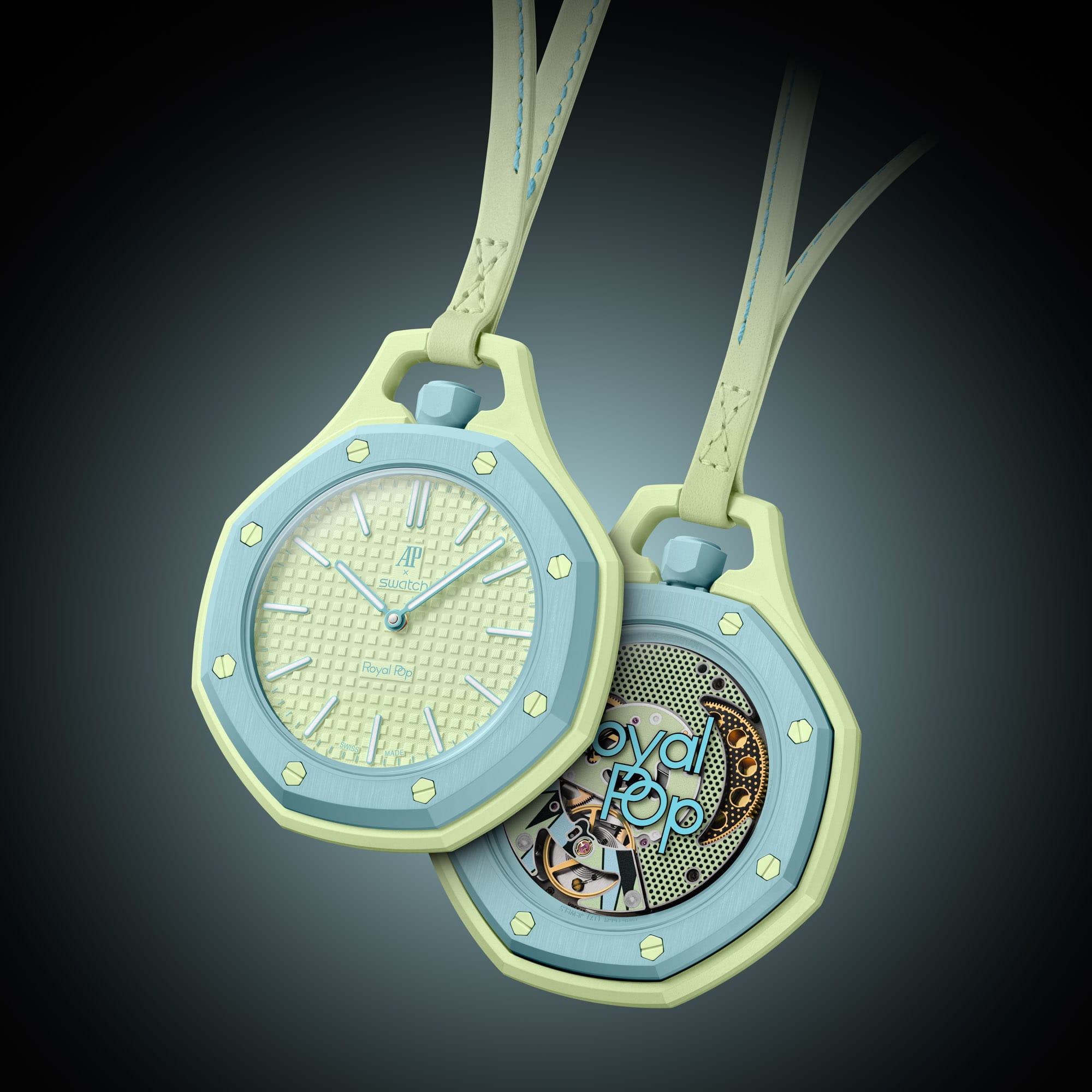
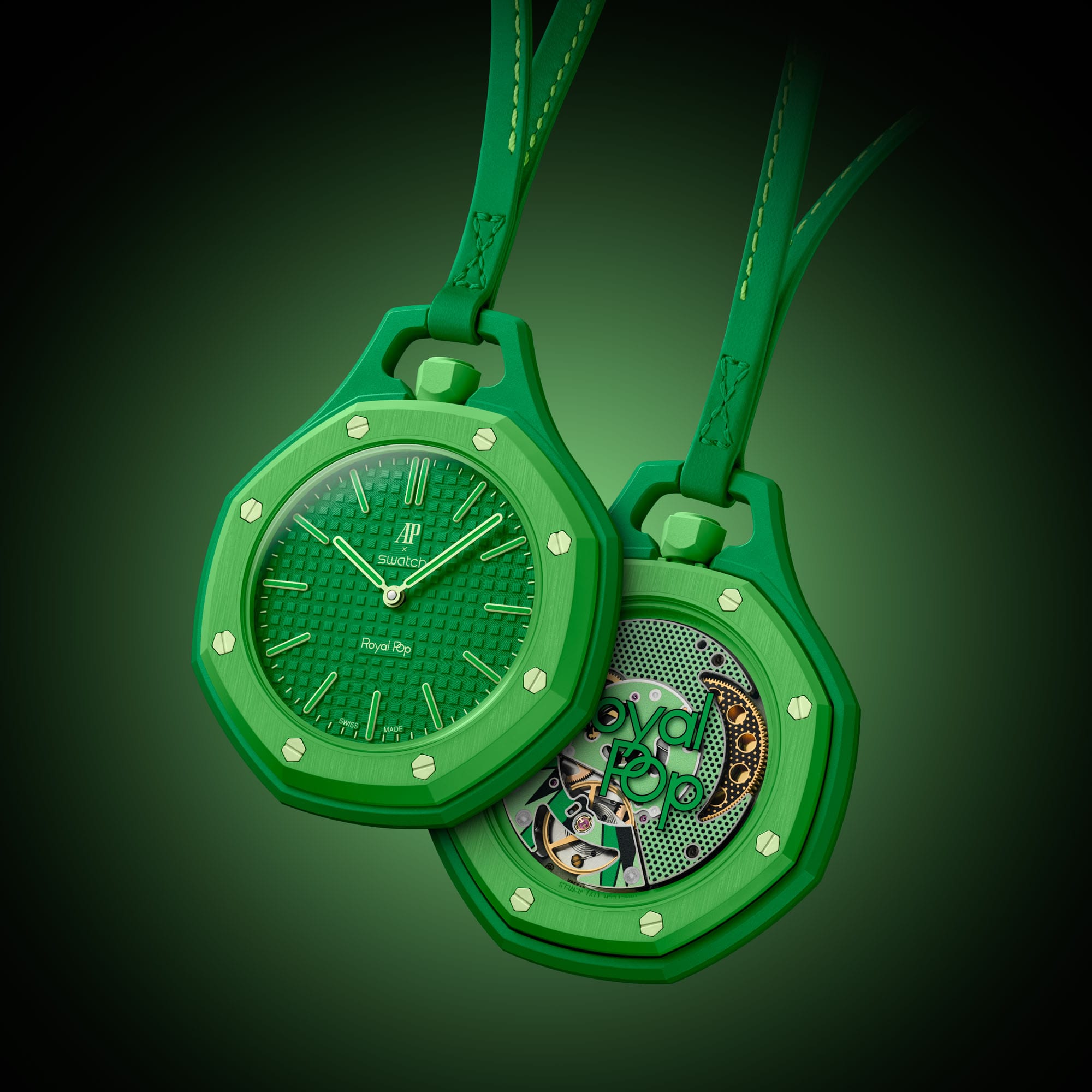
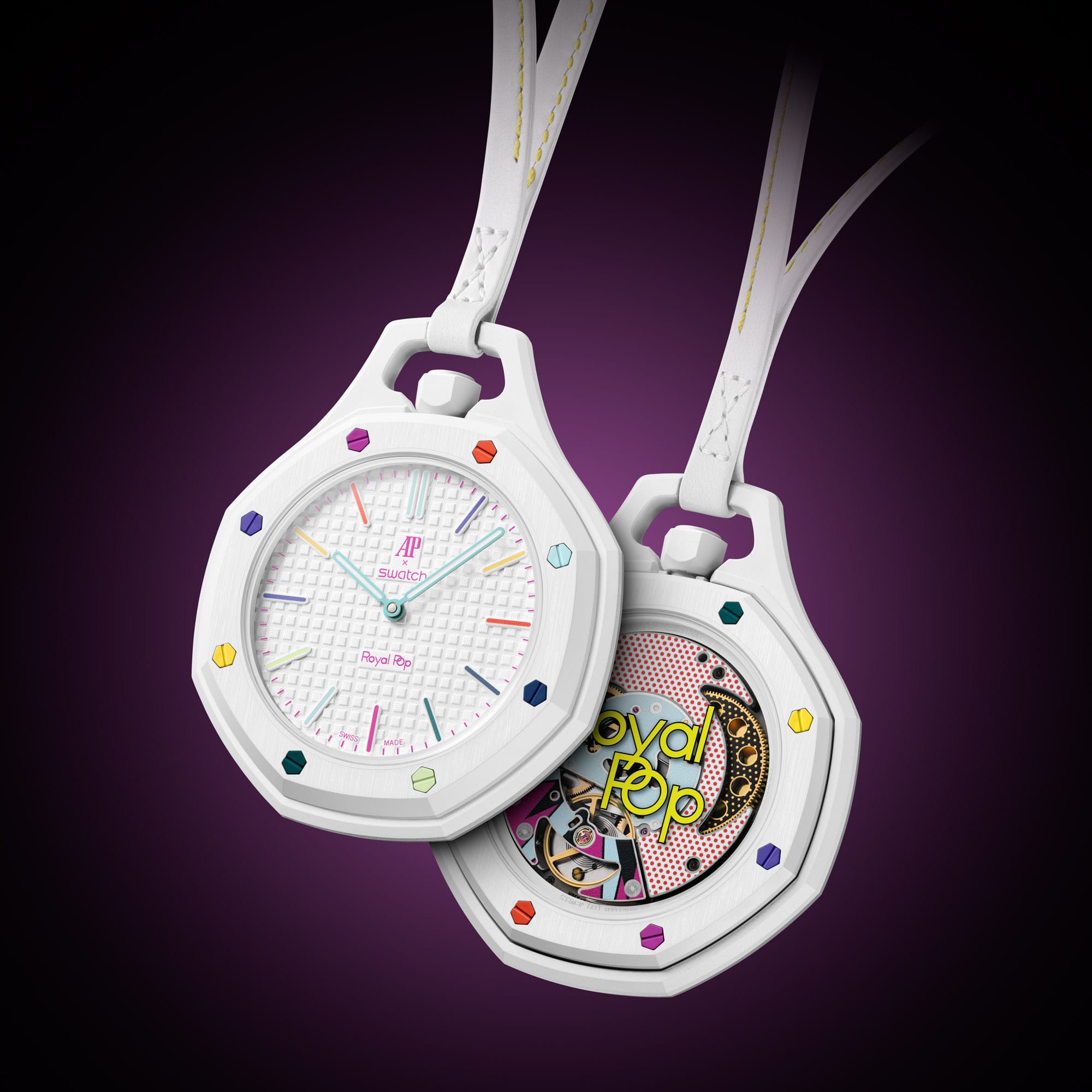
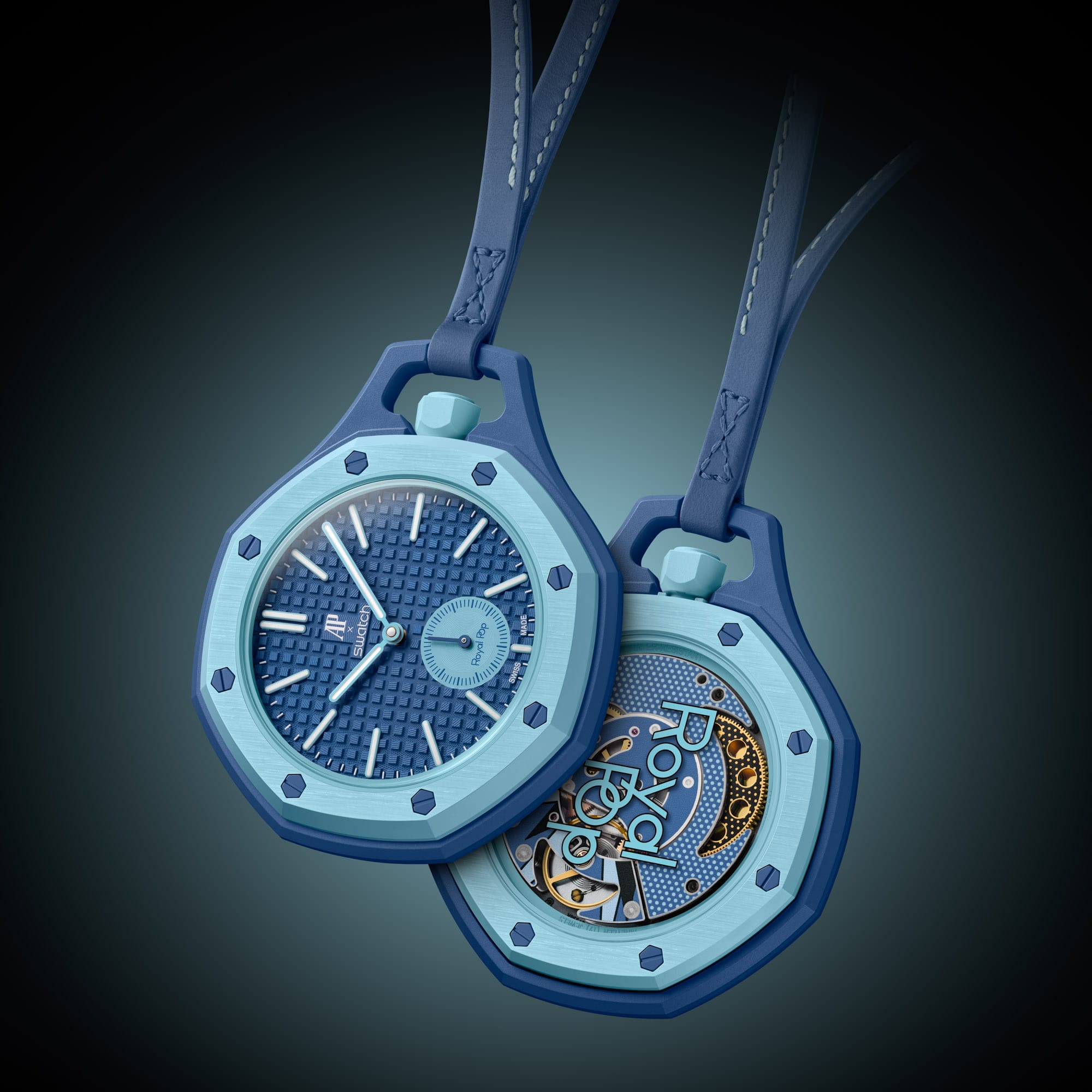
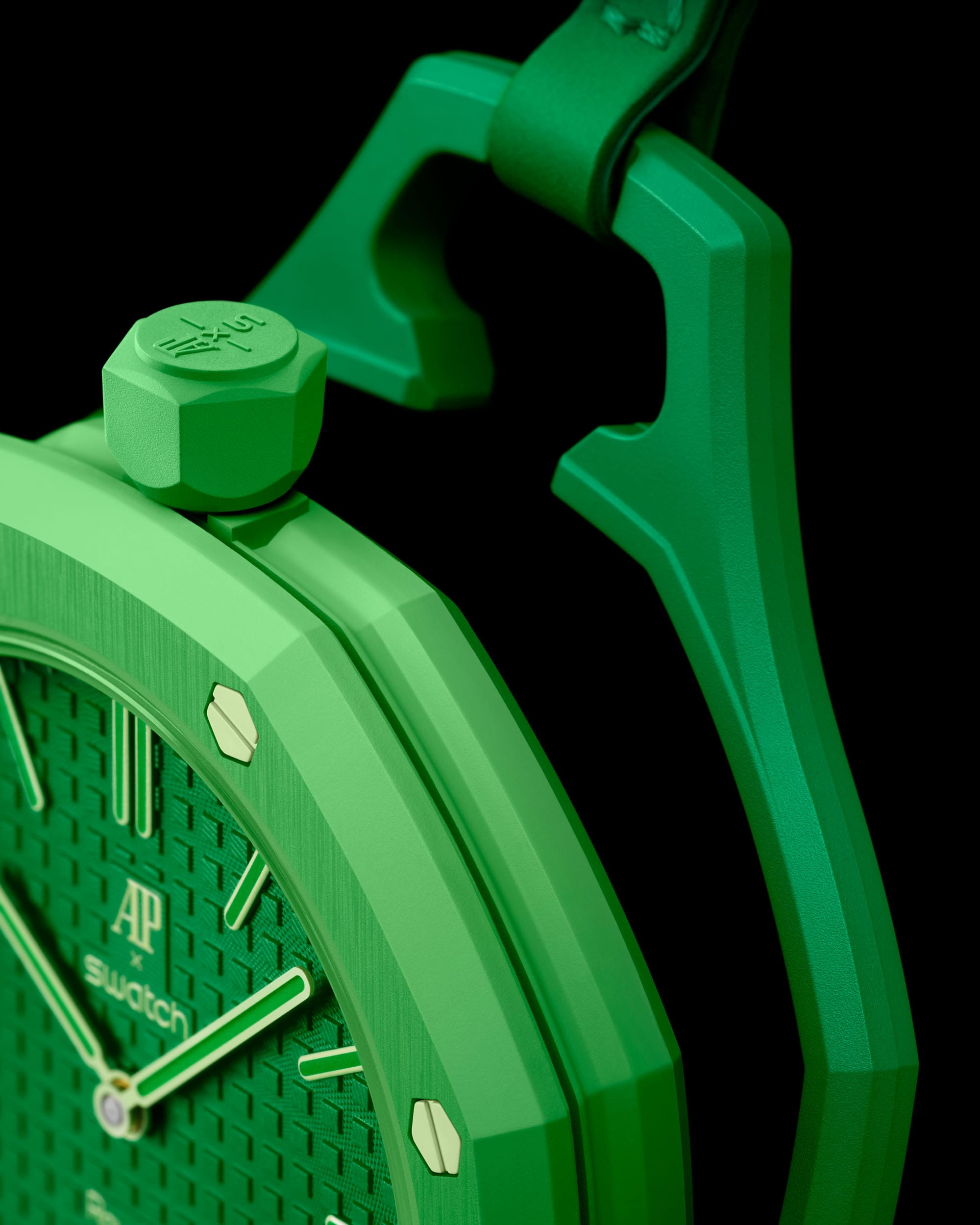
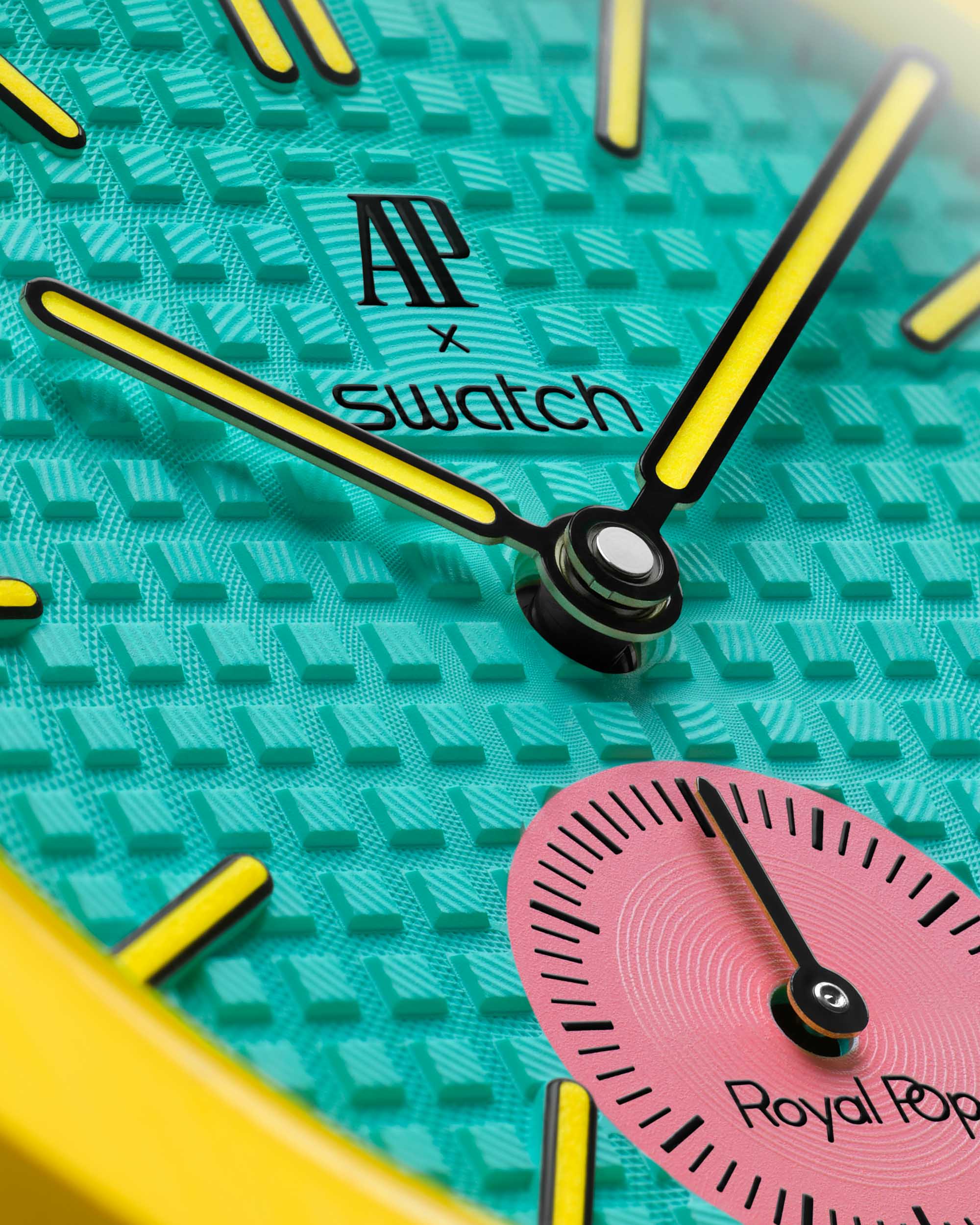
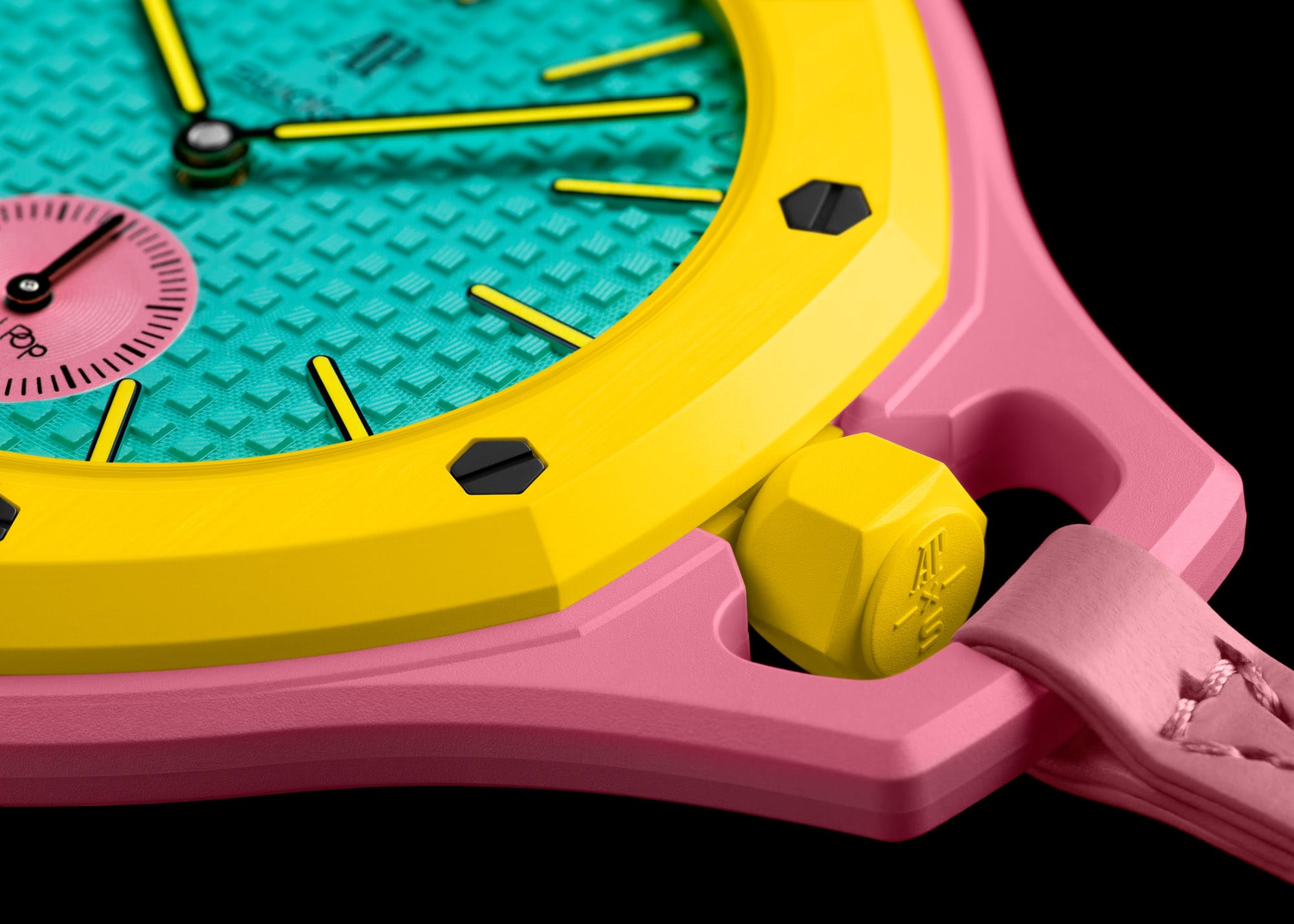
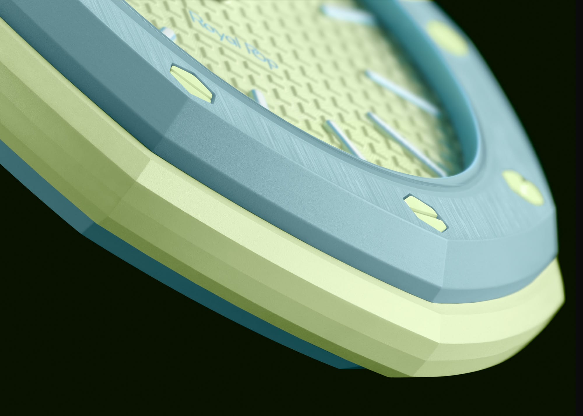
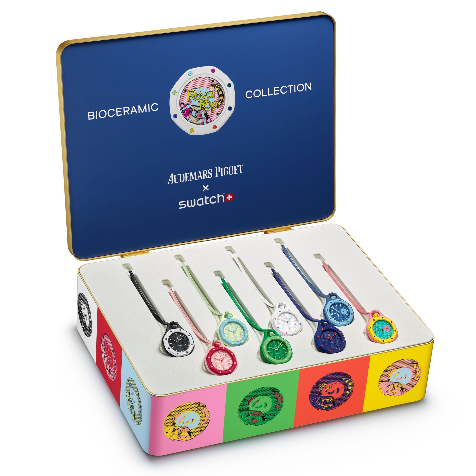
The Colors: Where This Collaboration Shines
If there’s one thing this release absolutely nails, it’s color.
The lineup is playful, expressive, and unapologetically bold:
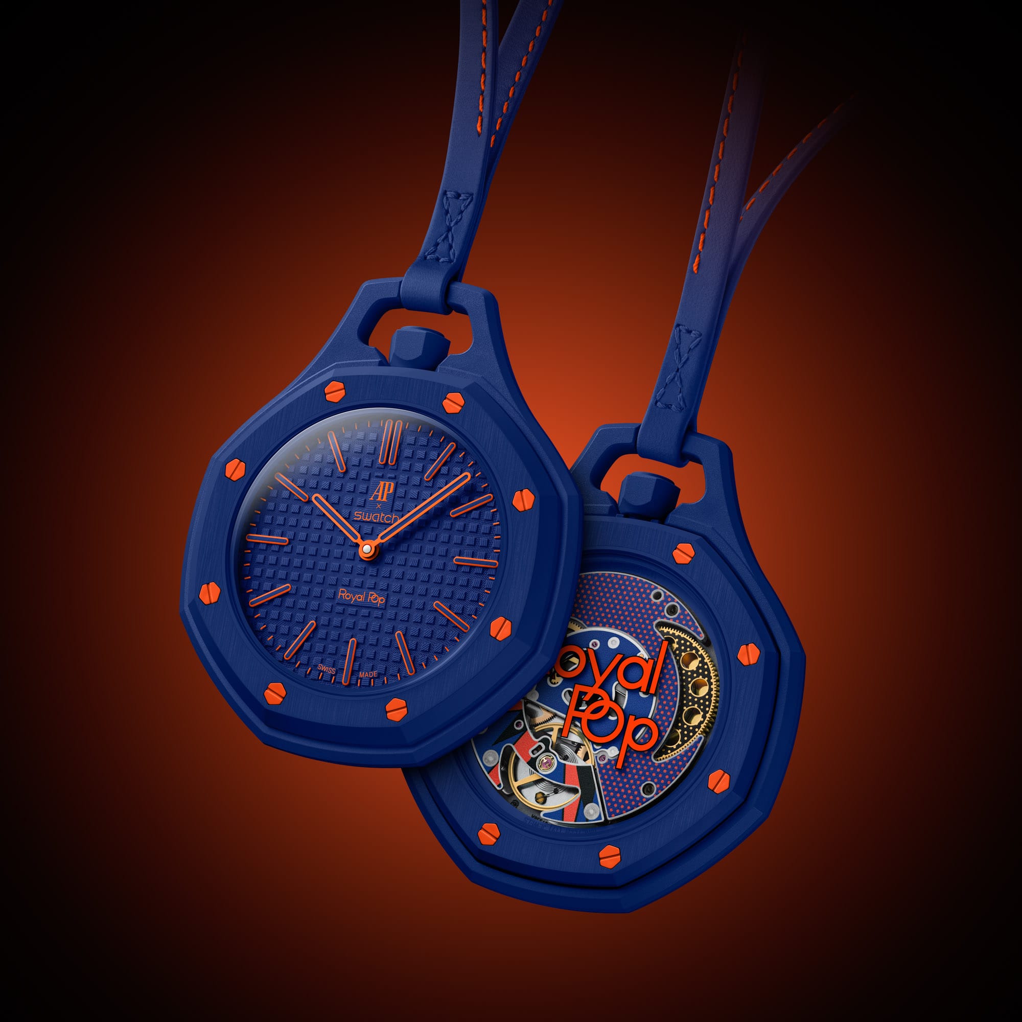
- Orenji Hachi – navy blue with orange accents
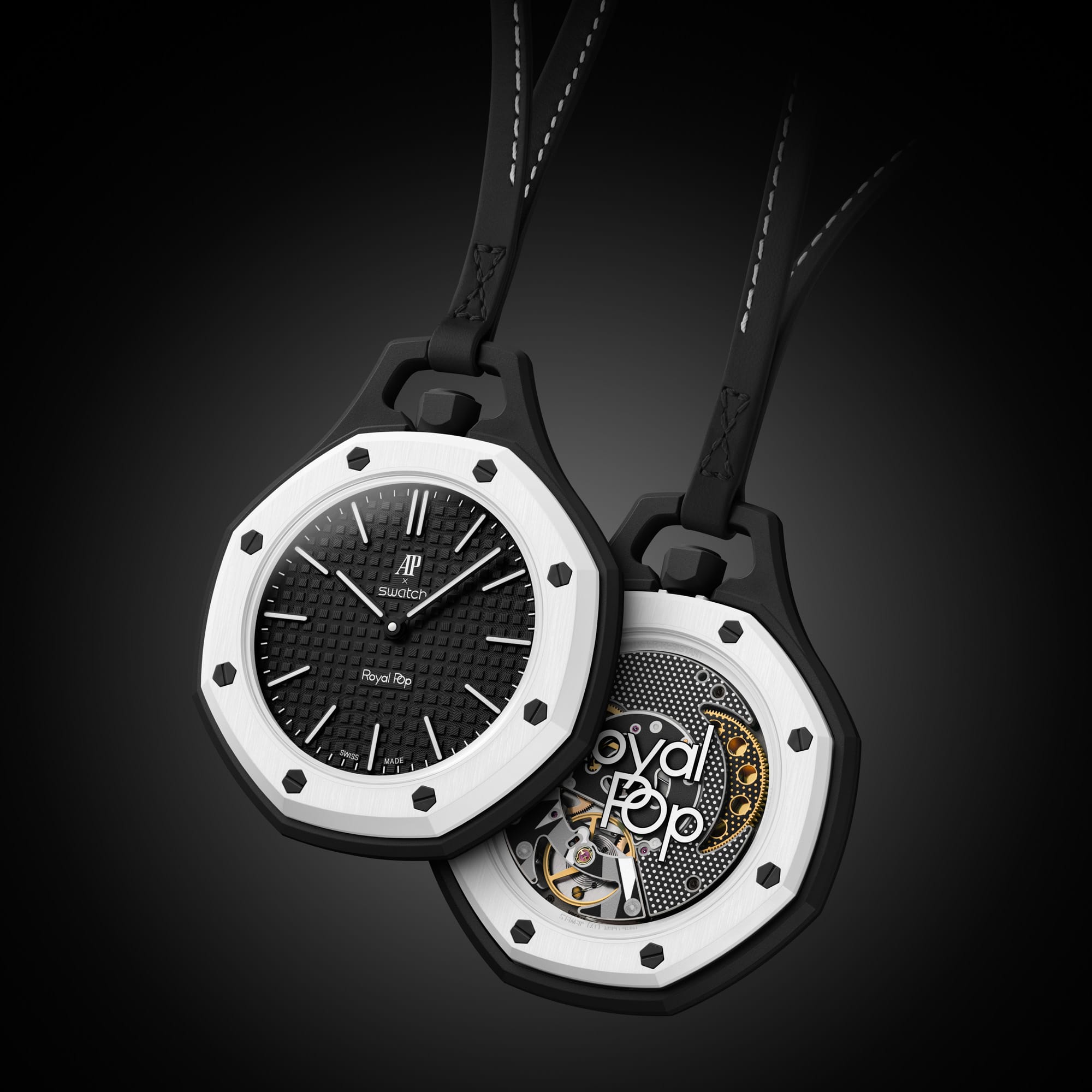
- Ocho Negro – black and white, clean and graphic
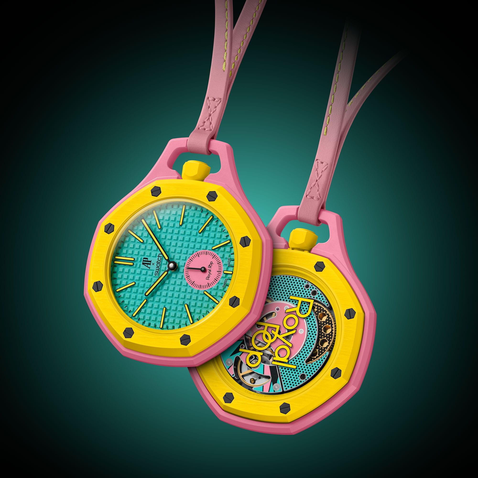
- Otg Roz – teal with yellow and pink (arguably the most fun—yes, very Simpsons-esque)
- Lan Ba – deep and light blue contrast
- Blaue Acht – blue with green undertones
- Green Eight – vibrant, almost electric green
- Huit Blanc – white base with colorful accents
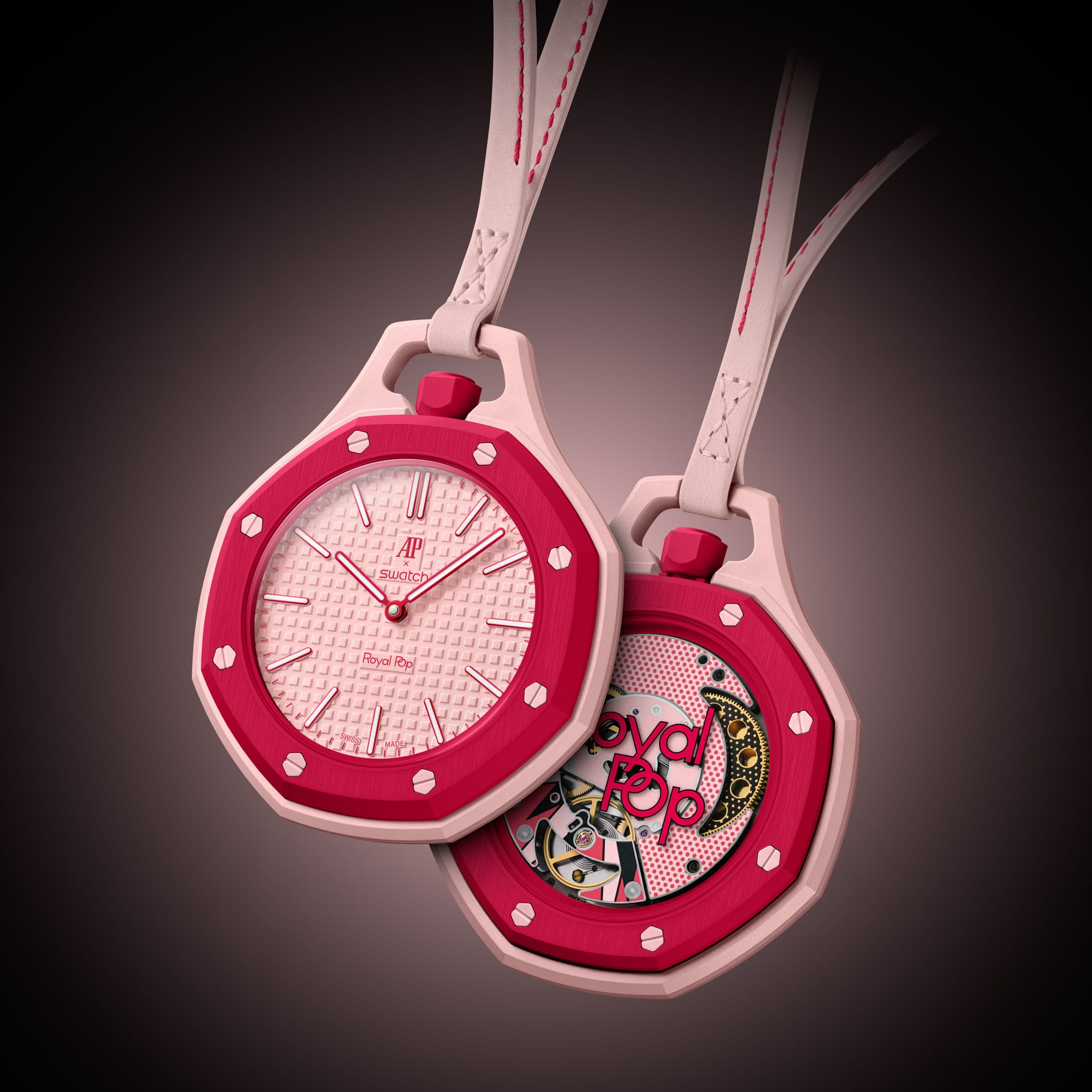
- Otto Rosso – pink and red, almost floral in tone
This is exactly the kind of palette that resonates with a younger audience—and frankly, even seasoned collectors looking for something less serious.
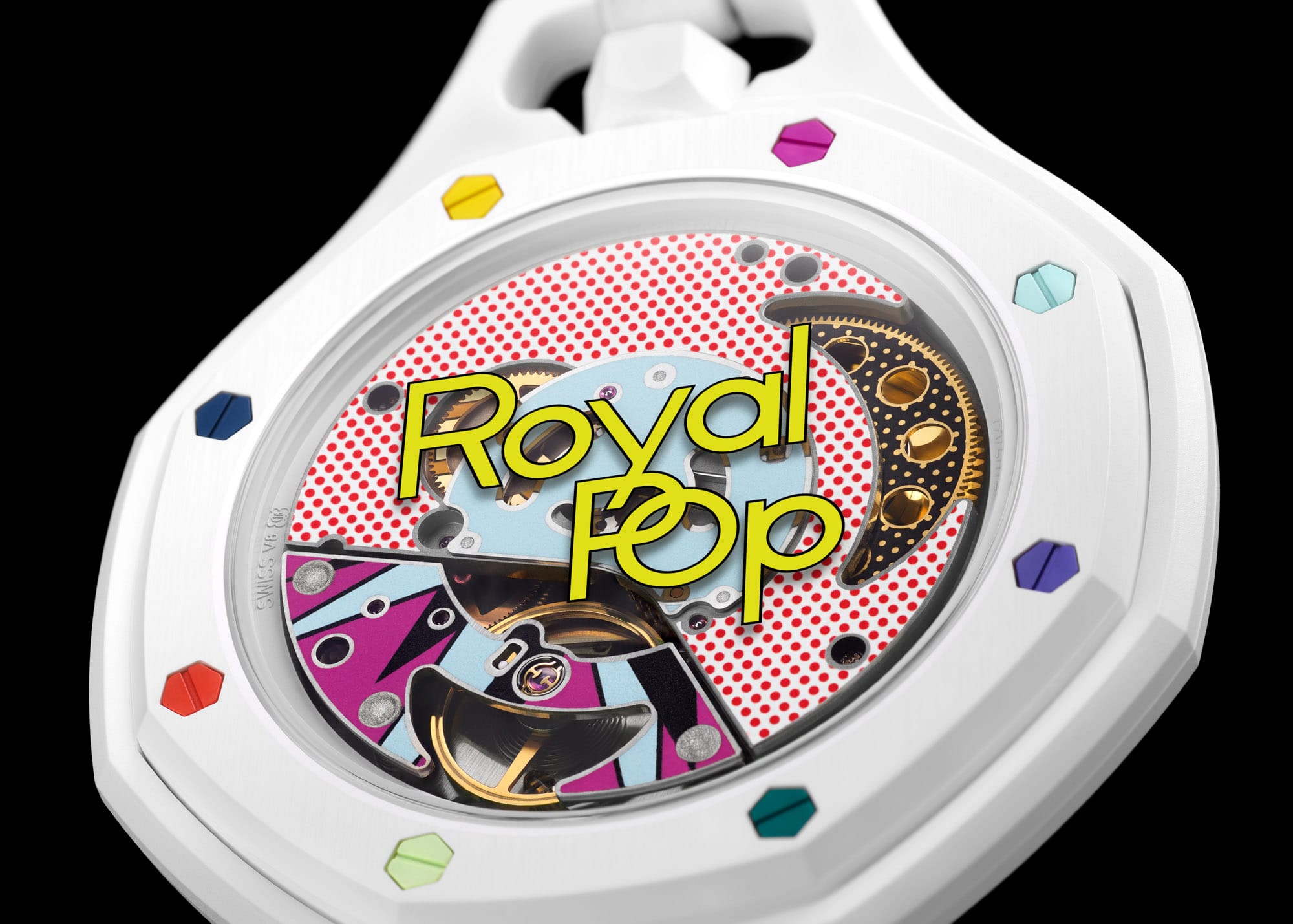
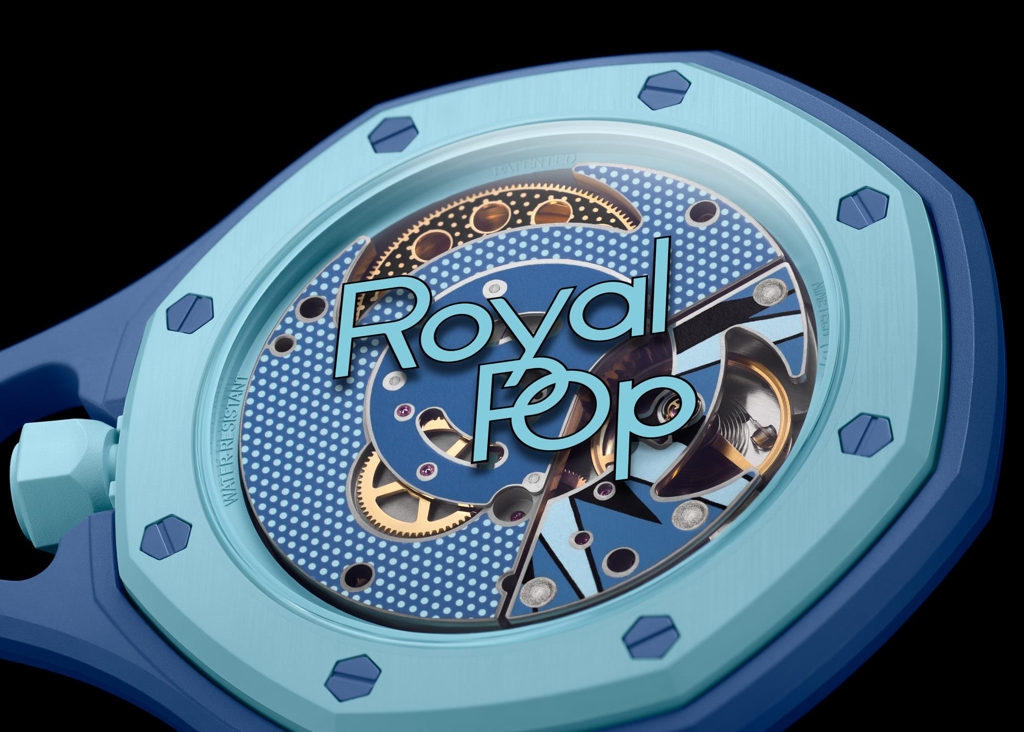
Under the Hood: Sistem51 (and Why It Matters)
At the heart of the Royal Pop is the Sistem51, which is one of the more interesting modern movements in accessible watchmaking.
Key Specs:
- Fully mechanical, automatic movement
- 51 components total (hence the name)
- Single central screw construction
- ~90-hour power reserve
- Anti-magnetic escapement
- Factory-sealed, non-serviceable design
- Swiss-made, fully automated assembly
The Sistem51 isn’t about traditional watchmaking romance—it’s about industrial innovation. It’s built entirely by machines, hermetically sealed, and designed to be replaced rather than serviced.
Purists may scoff at the non-serviceability, but that’s missing the point. This movement democratizes mechanical watchmaking in a way that aligns perfectly with what Swatch has always stood for.
And importantly—it’s mechanical. That alone gives this release credibility among enthusiasts.
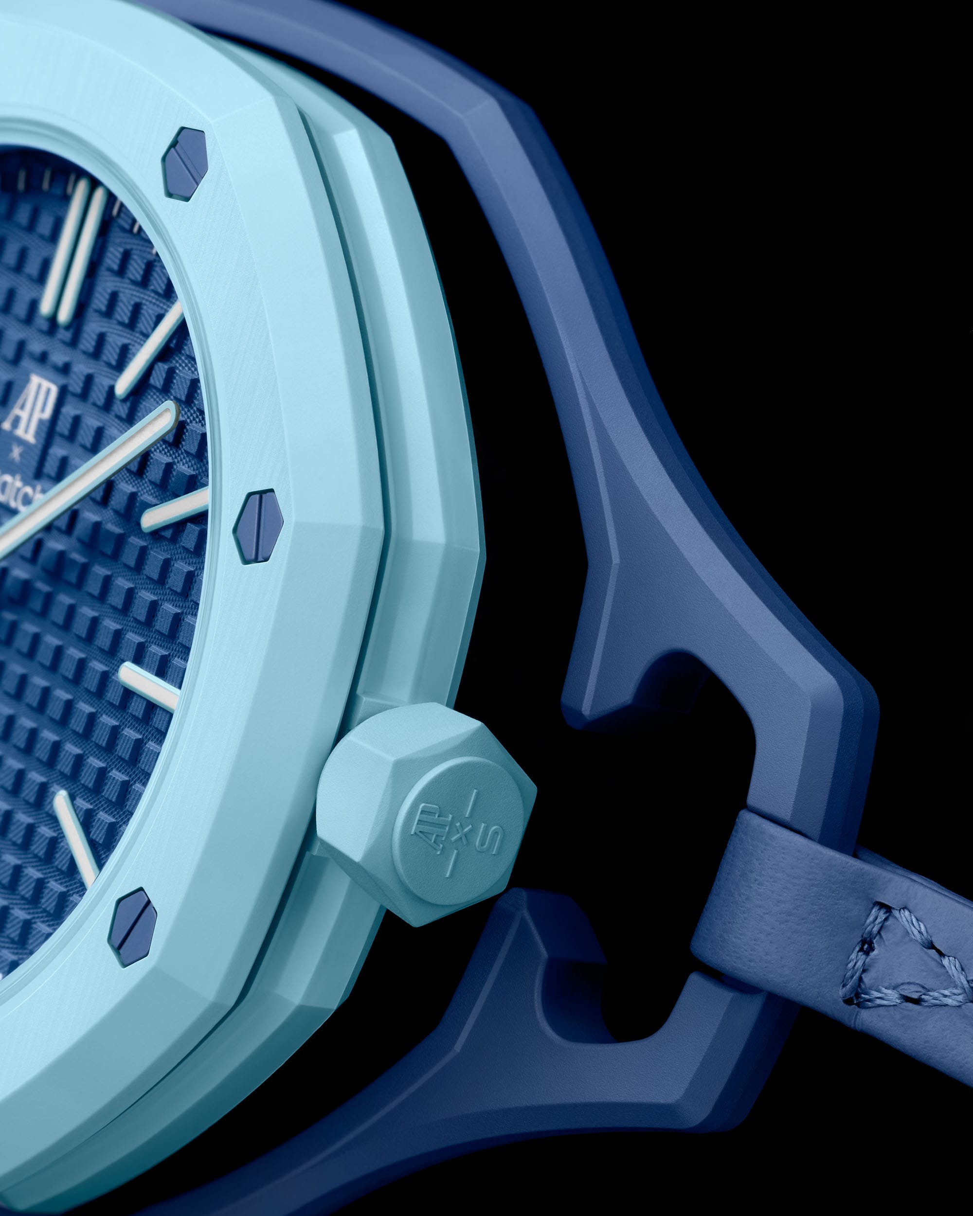
Materials and Build
- Case Material: Swatch BIOCERAMIC (lightweight, durable, slightly matte tactile feel)
- Water Resistance: 2 bar (splash-resistant)
This is clearly not meant to be a tool watch—it’s an object of design, expression, and accessibility.
The Bigger Picture: Why This Matters
This collaboration isn’t just about selling watches.
It’s about onboarding the next generation of collectors.
That’s something Audemars Piguet rarely does at scale—and it’s something the industry desperately needs. Younger buyers aren’t entering horology the same way previous generations did. They need:
- Lower barriers to entry
- Bold, expressive design
- Cultural relevance
- A sense of fun
This delivers on all four.
Final Take
Is it the MoonSwatch 2.0? No.
But it was never trying to be.
The Royal Pop may have stumbled out of the gate due to expectations, but viewed on its own terms, it’s a clever, creative, and likely very successful release. It won’t match the absolute frenzy of the MoonSwatch—but it doesn’t need to.
It just needs to spark curiosity.
And it will.
Personal Note
I’ll be honest—I wasn’t sold at first.
Now? I’m in.
I can easily see picking up a few—especially for the kids. It’s a fun entry point into watches, something playful and memorable. And honestly, I might end up clipping one onto a travel bag or tossing it into my own rotation in some unconventional way.
That’s the beauty of this release—it invites you to interact with it differently.
Check it out by clicking here.